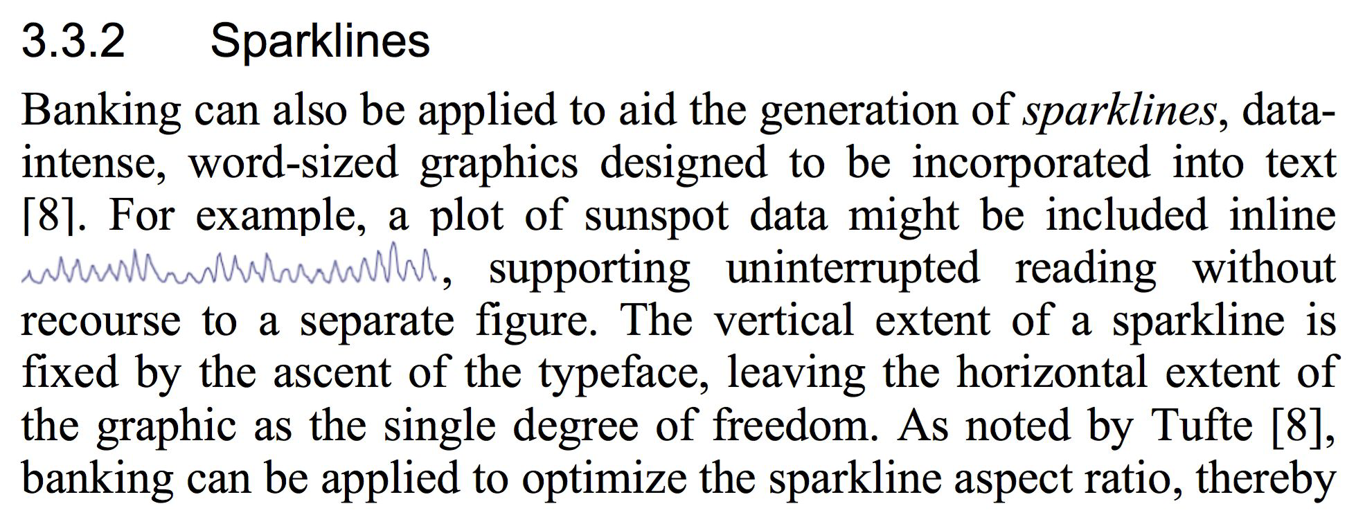
Introduction to Visualisation Charts#
Today’s Topics#
Viz Fundamentals
How to
make fantastic charts
produce better graphs
give better visual explanations
Viz Fundamentals#
Why do we make data visualisation?#
Exploration:#
to learn something
Explanation:#
to show something
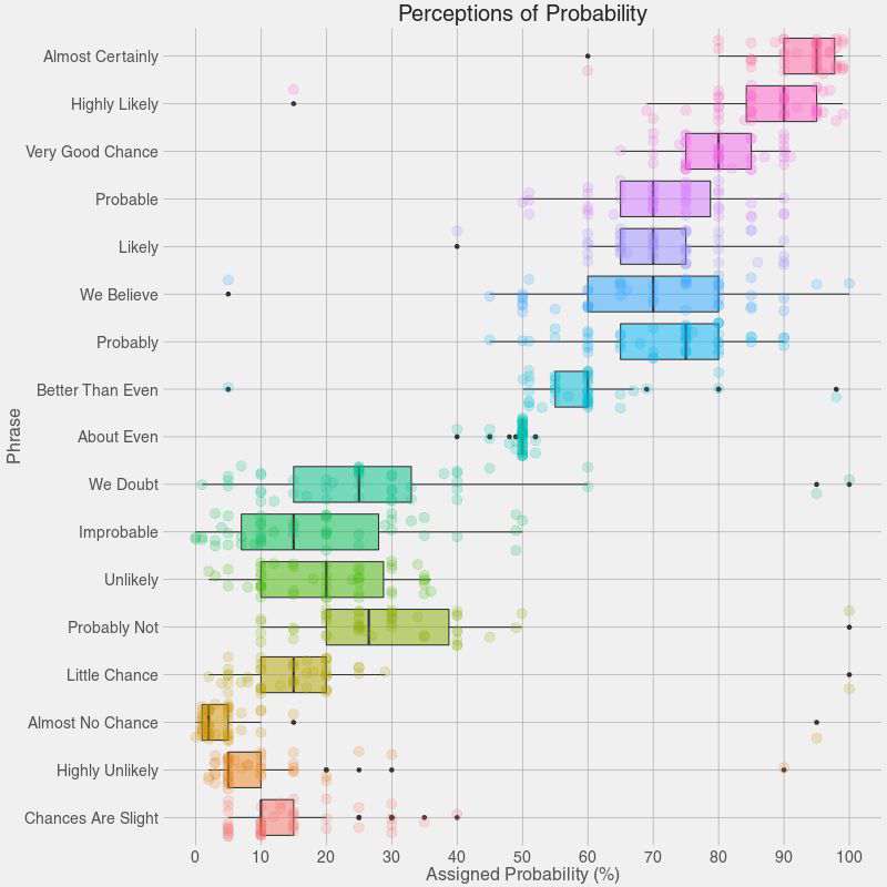
What makes a good data visualisation?#
Message
Accuracy
Efficiency
Accessibility
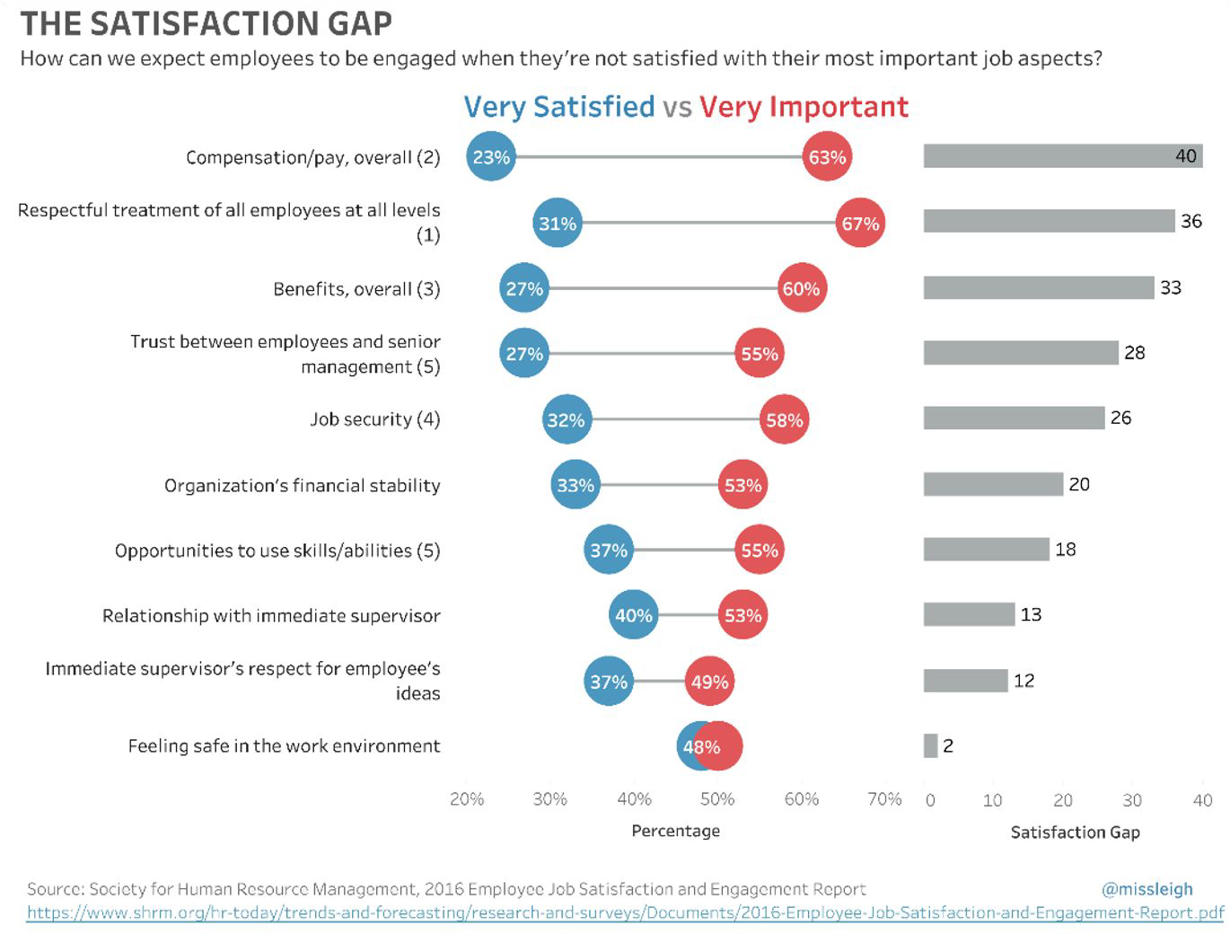
Message#
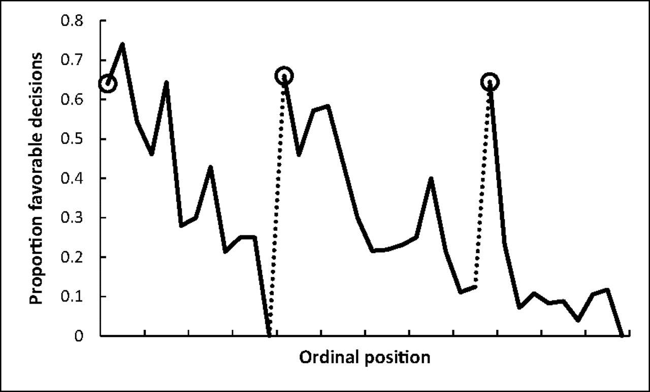
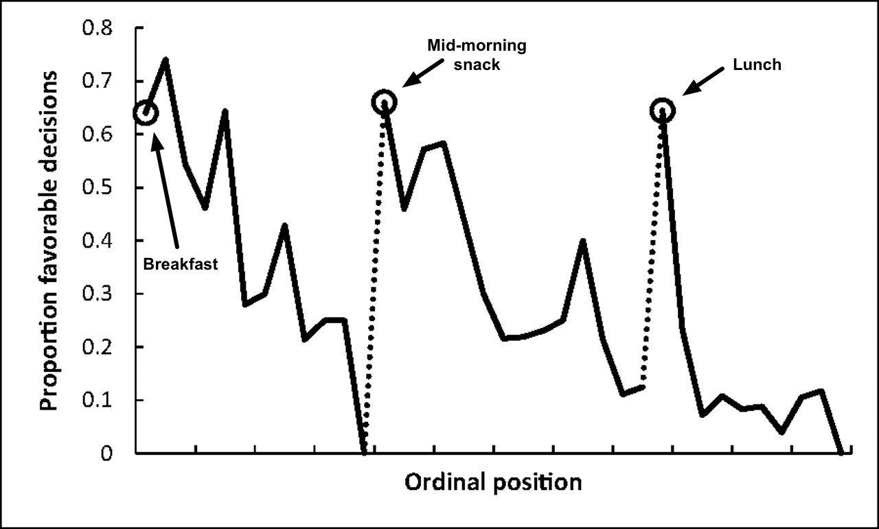
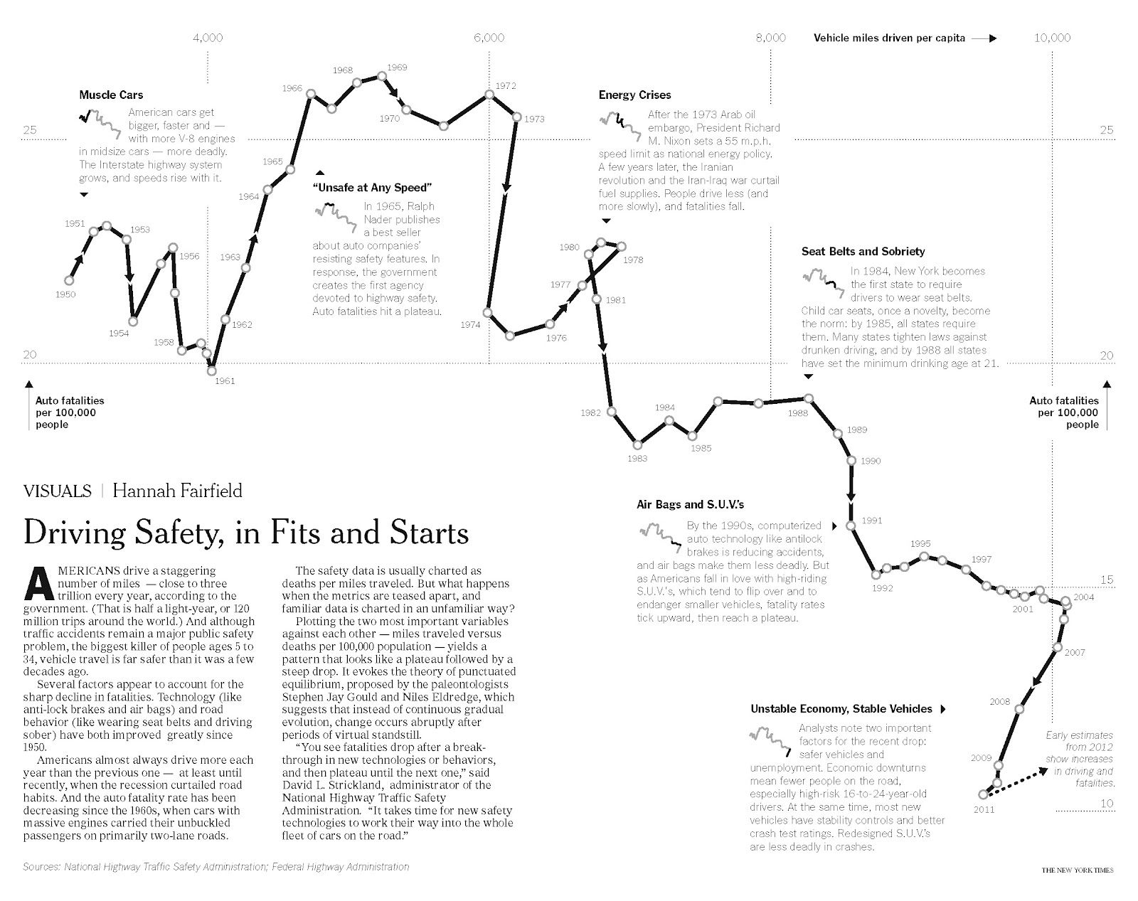
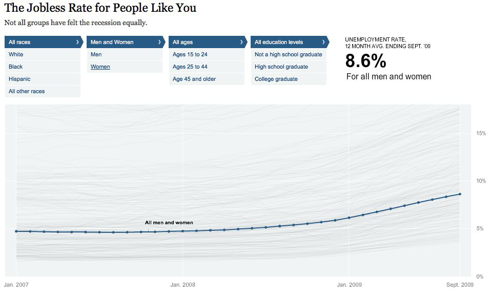
Proportion of rulings in favor of the prisoners by ordinal position. Circled points indicate the first decision in each of the three decision sessions; tick marks on x axis denote every third case; dotted line denotes food break. Because unequal session lengths resulted in a low number of cases for some of the later ordinal positions, the graph is based on the first 95% of the data from each session.
Accuracy#
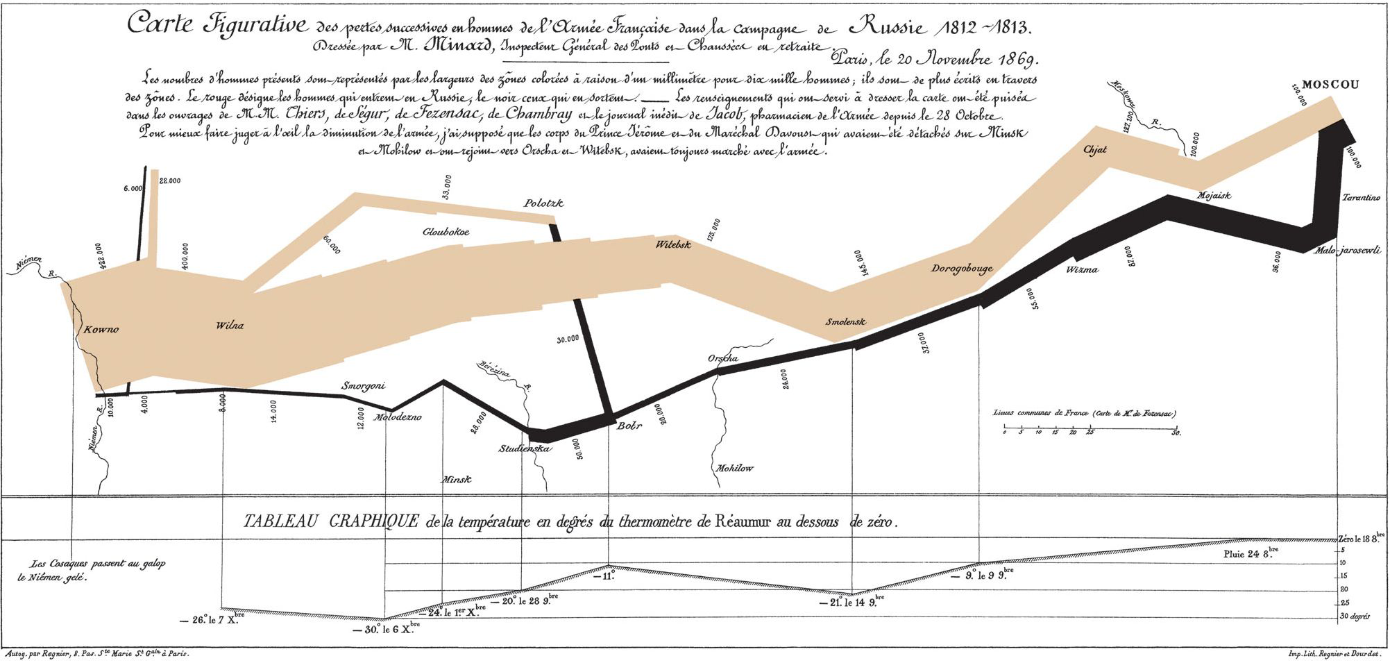
The Golden Age of Statistical Graphics#
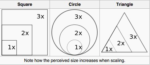
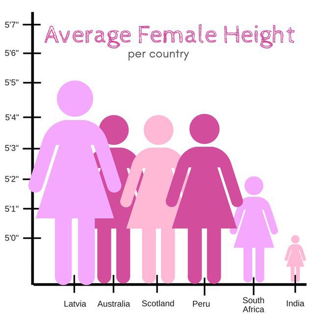
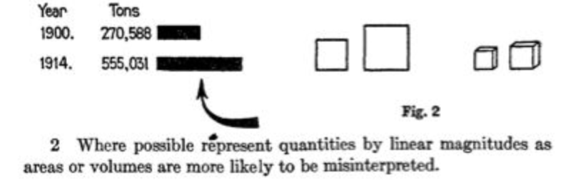
Lengths vs. Areas#
length_vs_area()
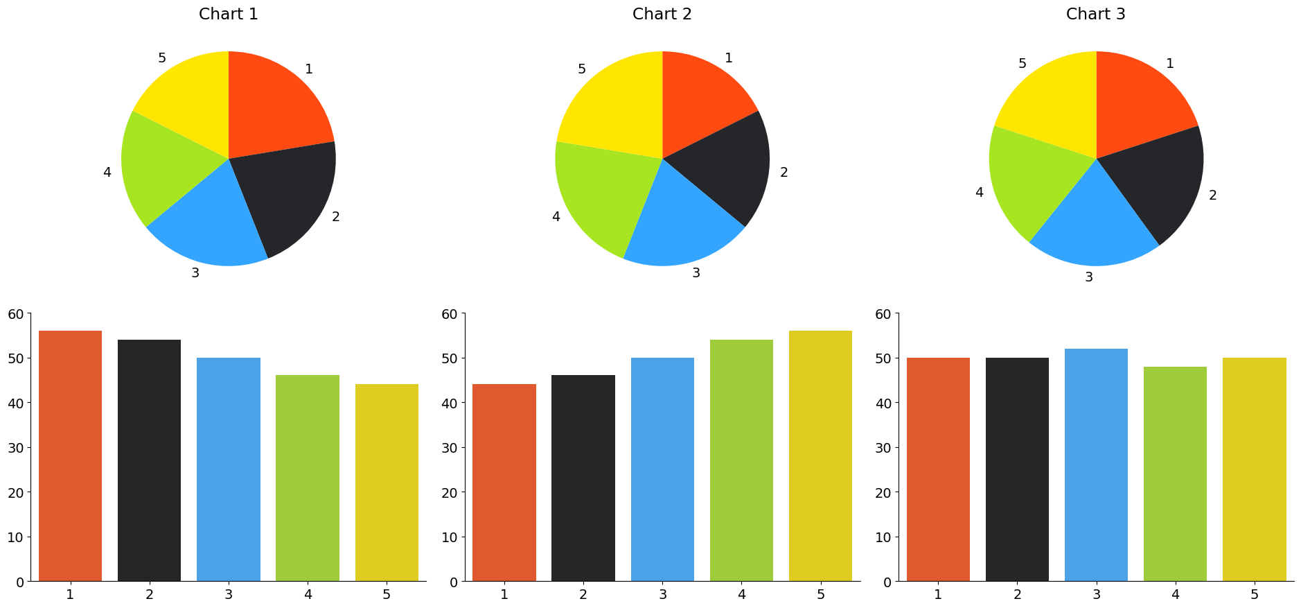
Lengths vs. Areas#
Let’s check in with our 1915 standards
Lengths vs. Volumes#
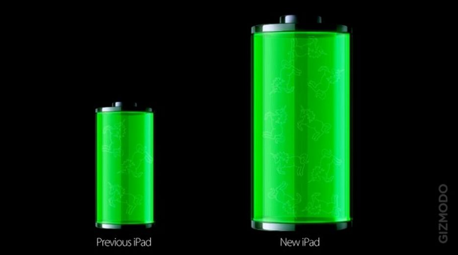
Let’s check in with our 1915 standards
Efficiency#
“Data-ink ratio”#
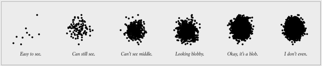
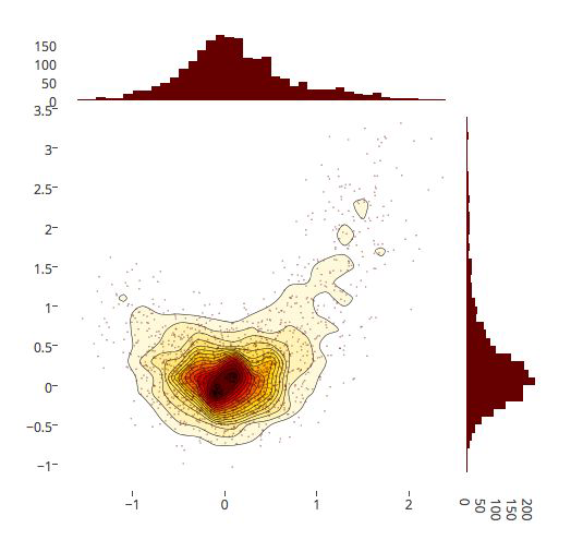
Accessibility#
Colors#
Colors#
Patterns#
Patterns#
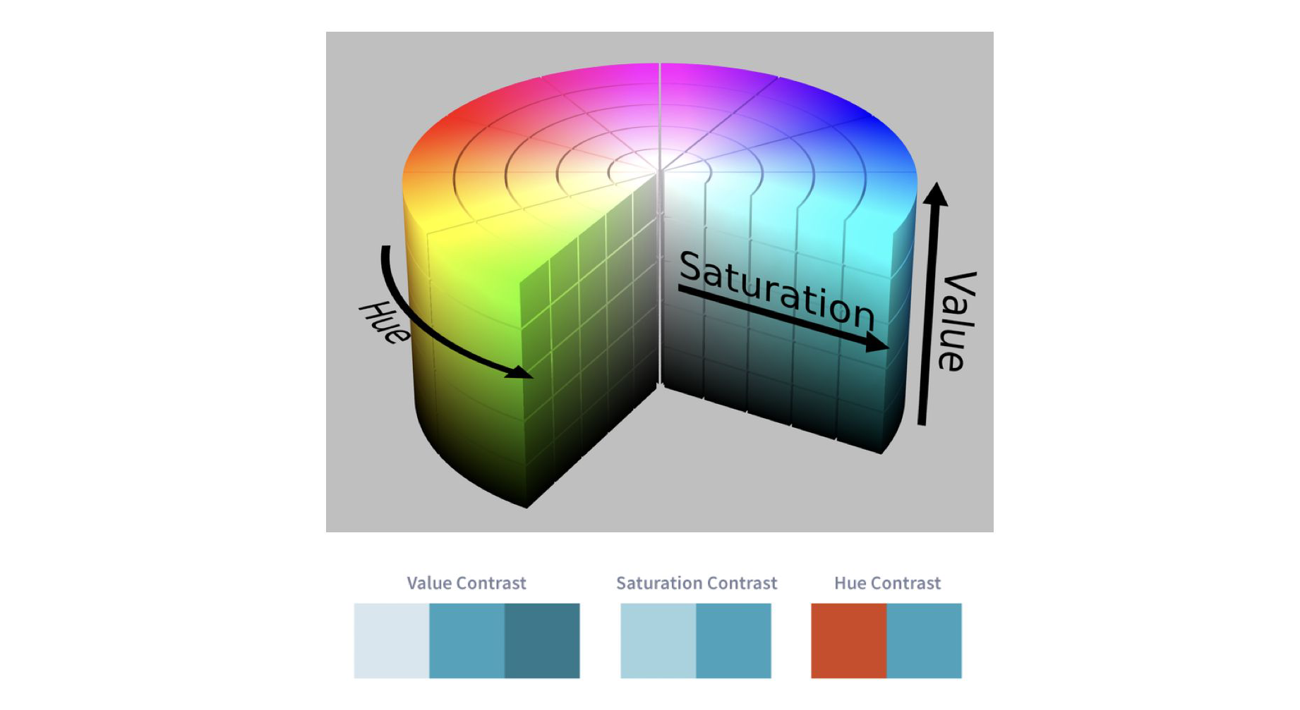
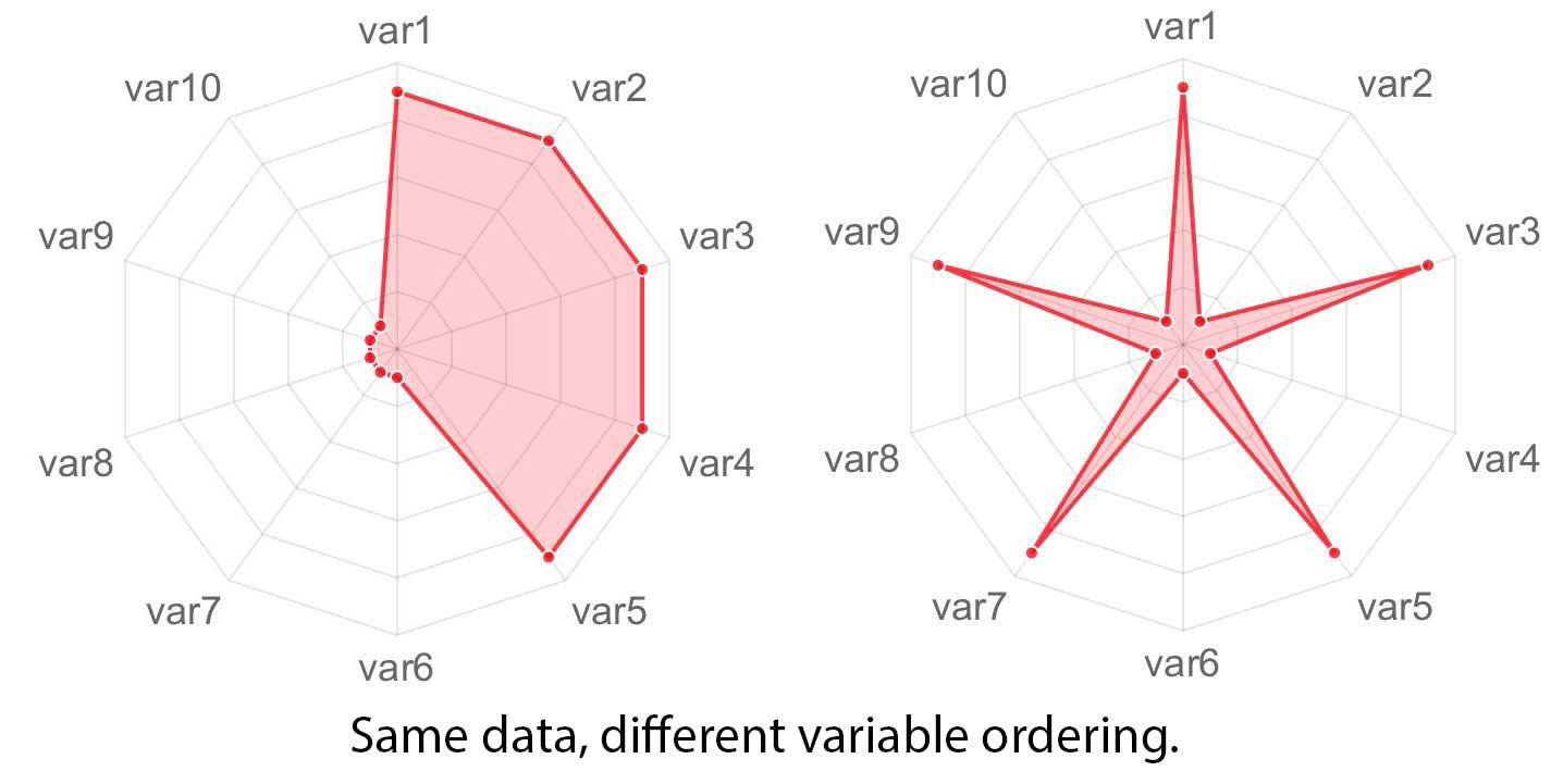
HSV Color Space#
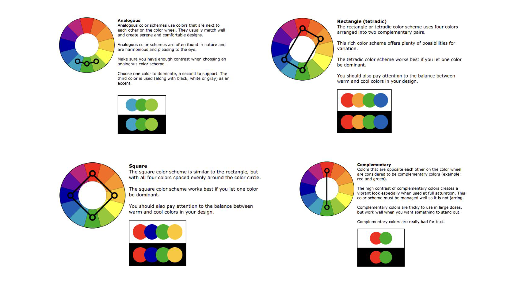
Color Schemes#
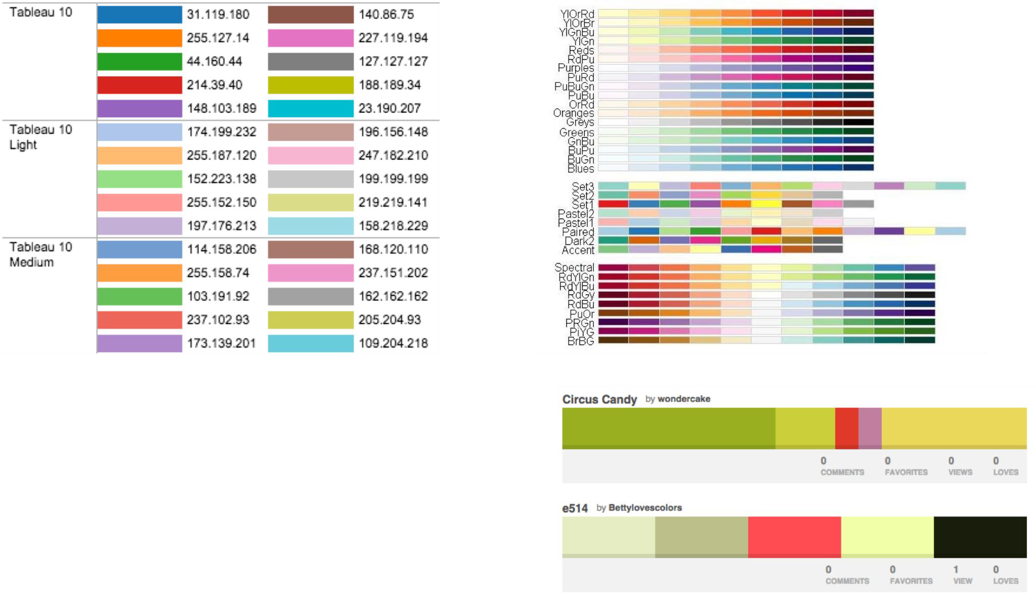
Color Palettes#
Accessibility Guidelines#
Ensure sufficient contrast and separation between elements in the visualization.
Do not rely on color alone to convey information, and ensure colors used can be distinguished between by people with various forms of color blindness.
Provide a text summary of the visualization, making sure to describe trends or patterns in the visualization.
Ensure text is readable.
Prefer simple and understandable language.
Prefer simple, familiar visualizations over complex novelties.
If using animations or movement in the visualization that can be distracting, allow the user to turn this off, and respect the “prefers-reduced-motion” CSS media feature when relevant.
Make the data available in an accessible table format.
Make interactive visualizations keyboard-accessible.
Ensure the visualization is responsive to different screen sizes and zoom levels.
What makes a good data visualisation?#
Message
Accuracy
Efficiency
Accessibility
Fantastic Charts and How to Make Them#
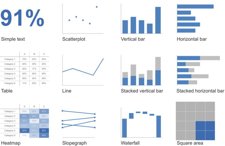
Simple Text#
e.g. 91%
If you’ve only got one or two numbers a chart might be a waste of time.
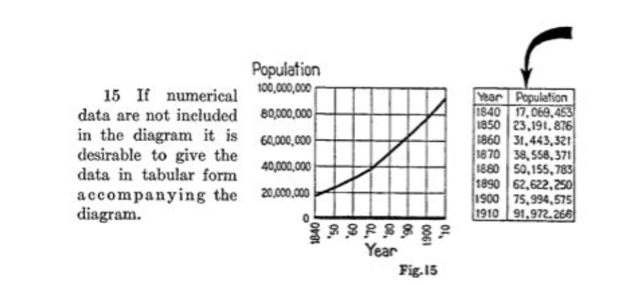
Tables#
For visual presentation of numbers… just don’t!
But people like tables.
A table works best…
when it is used to look up individual values
the values must be expressed precisely
A graph works best when…
the message is contained in the shape of the data (patterns, trends, exceptions to the norm)
entire sets of values must be compared
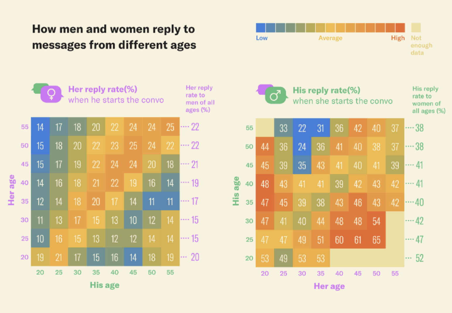
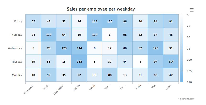
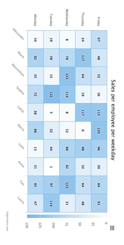
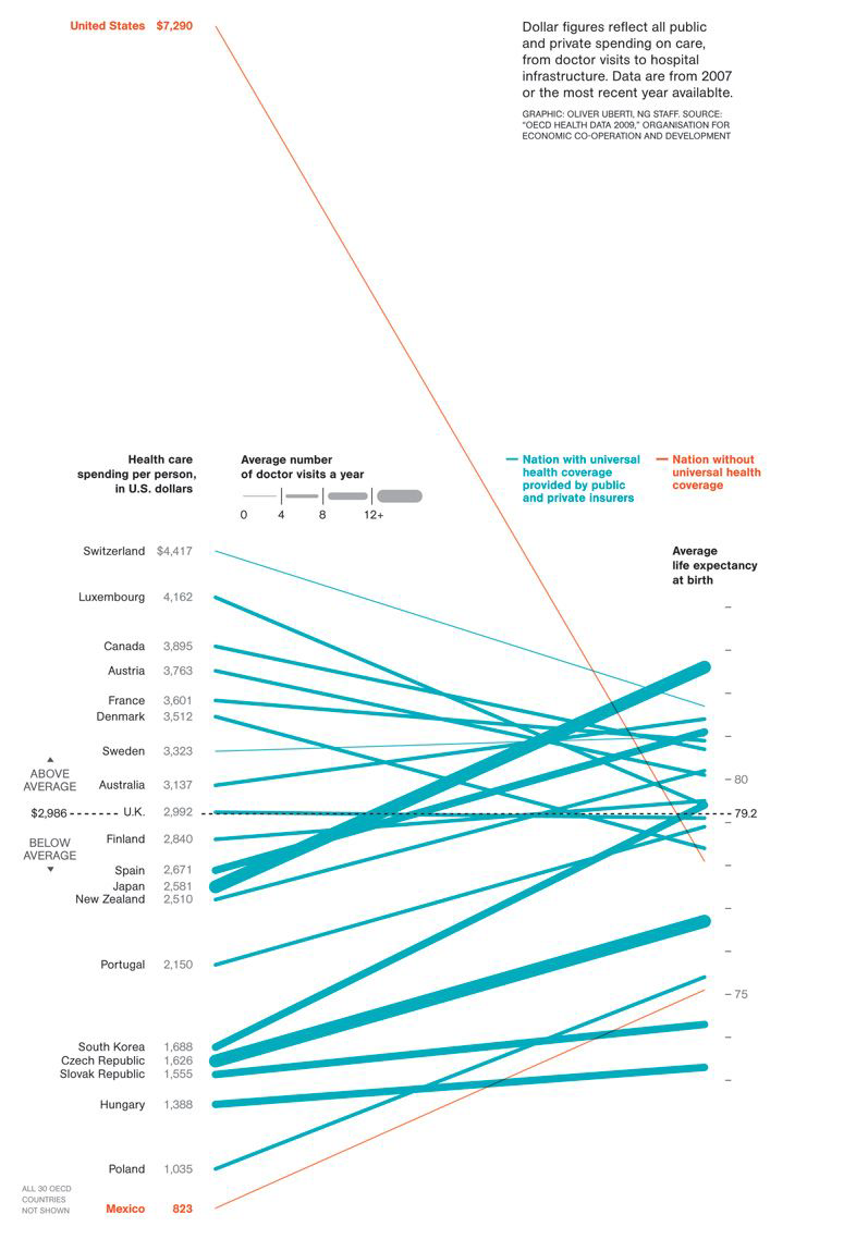
Heat map#
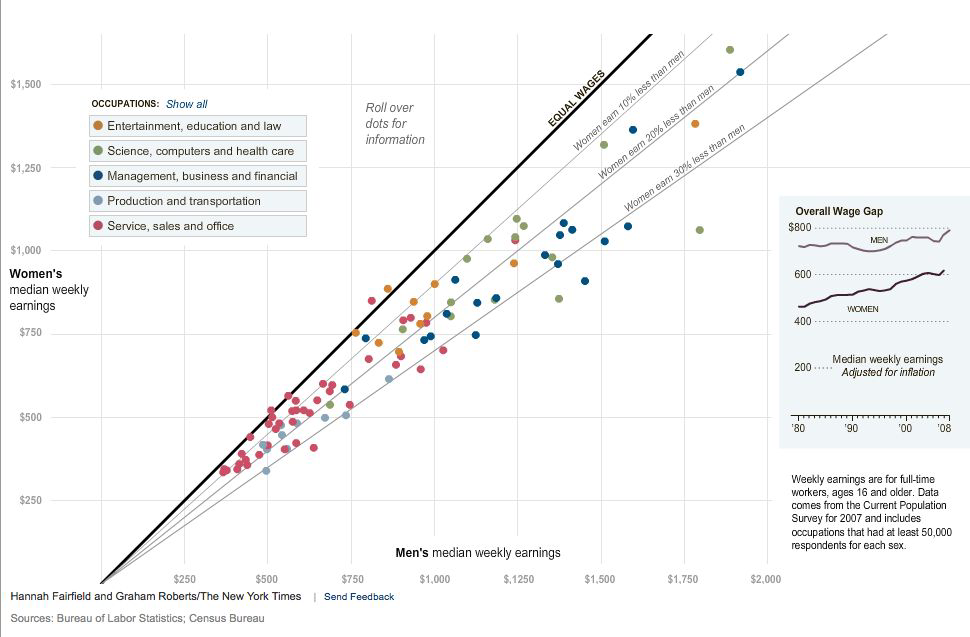
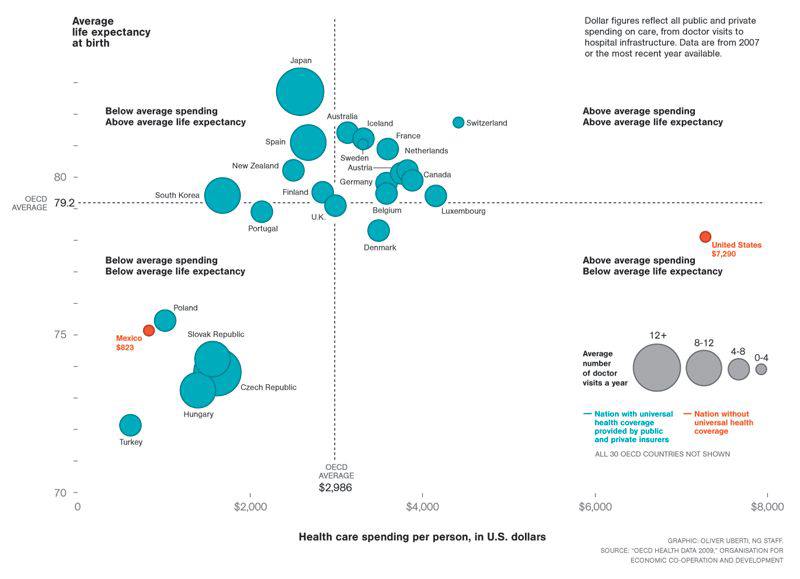
Scatterplot#
Maps data to 2D position.
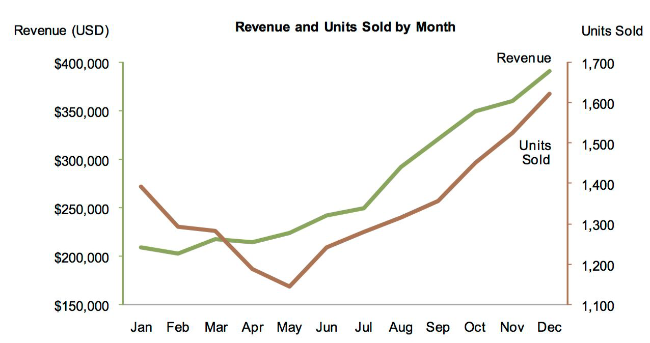
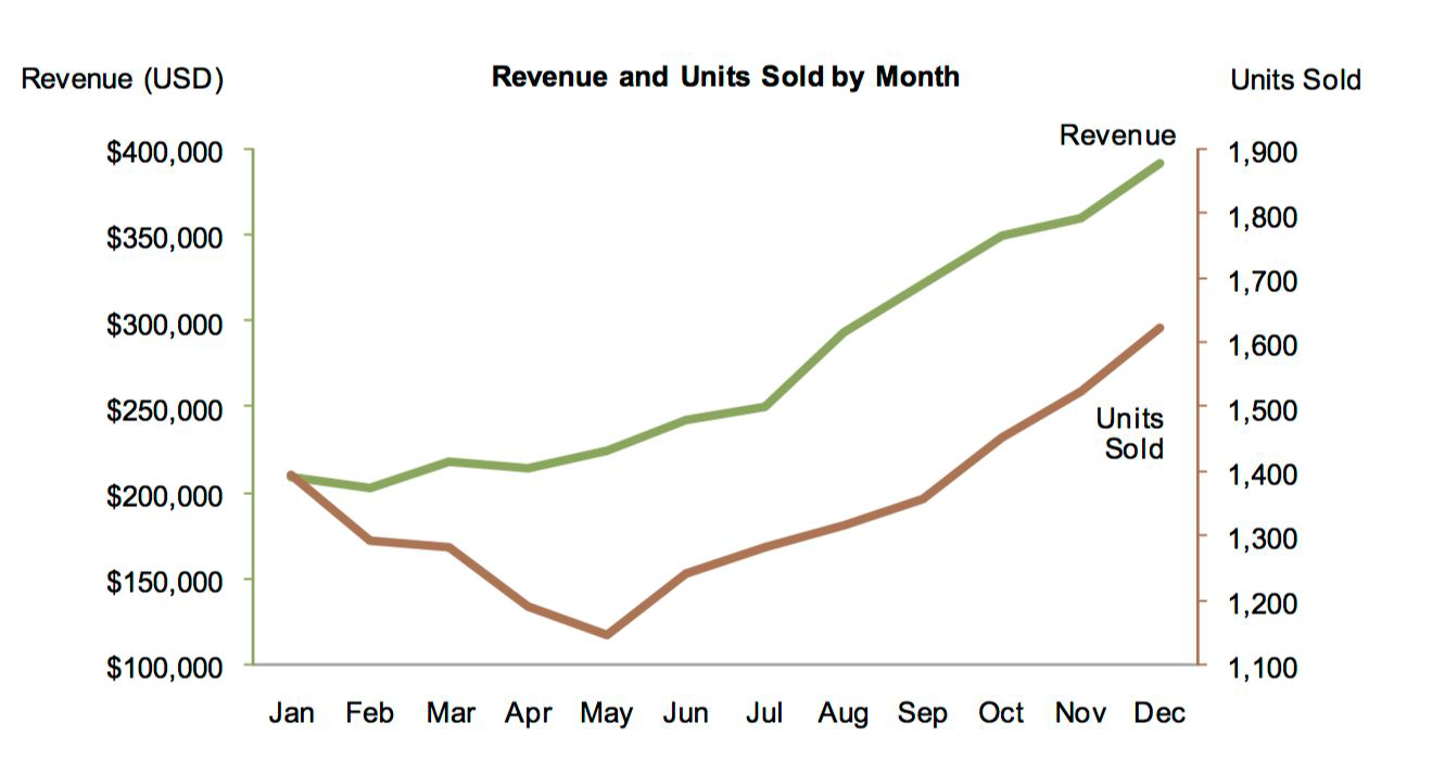
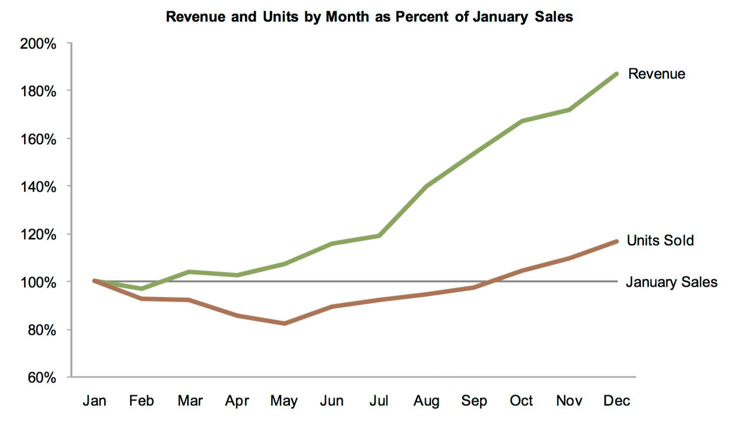
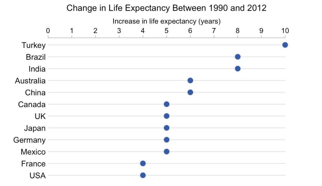
Line Chart#
One more type…#
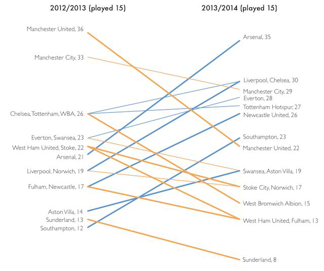
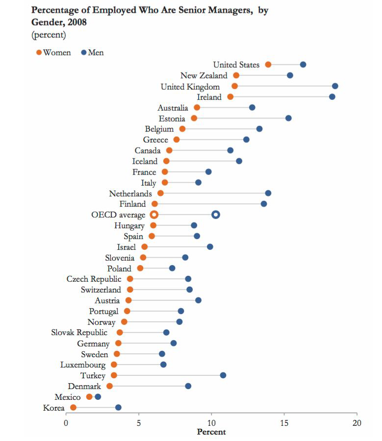
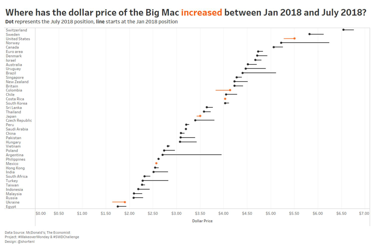
Slopegraph#
Two points of comparison
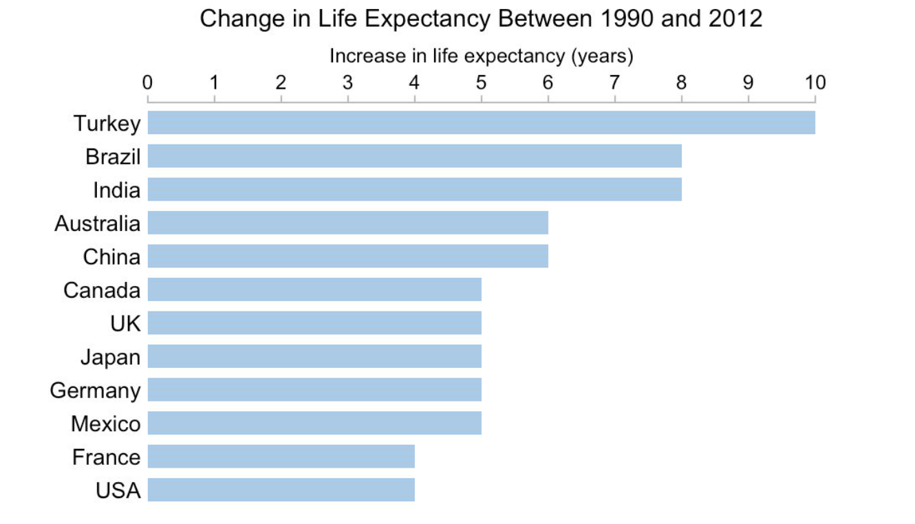
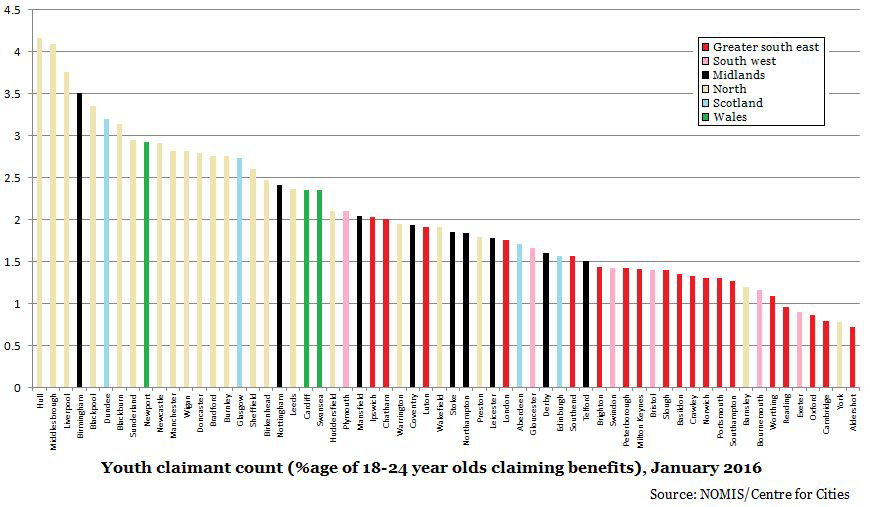
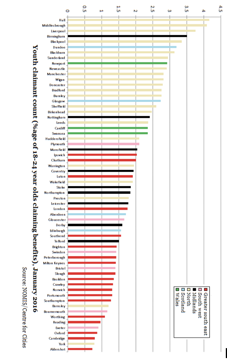
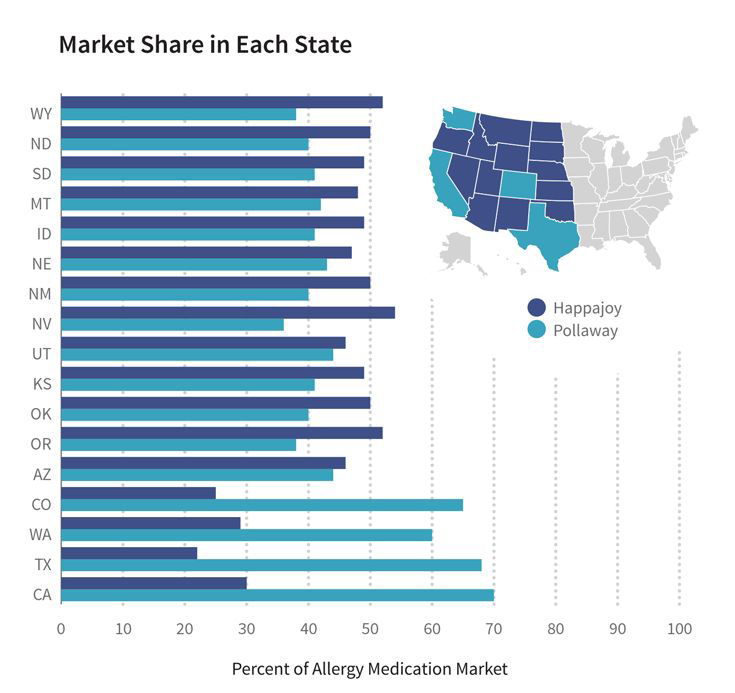
Bar Chart#
Your go-to chart for → categorical data
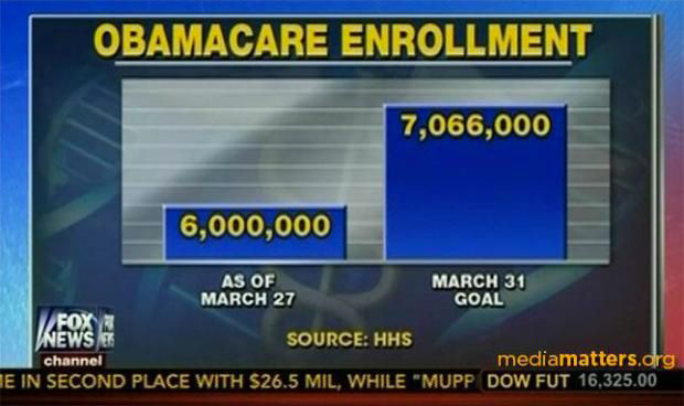
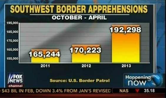
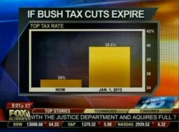
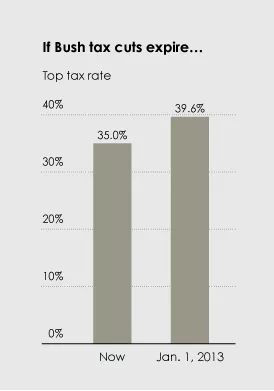
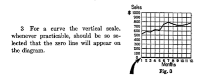
Bar charts must have a zero baseline#
from IPython.display import YouTubeVideo
YouTubeVideo("14VYnFhBKcY", width=400)
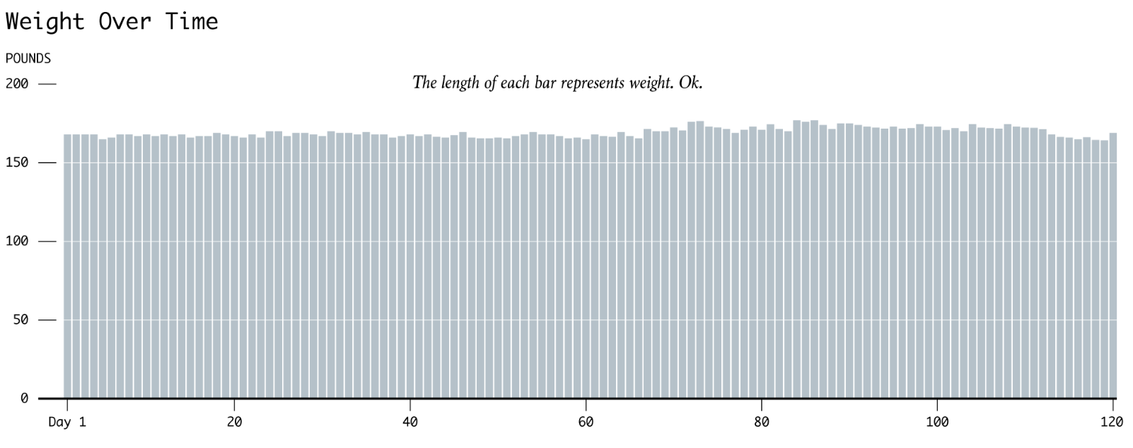
But all my values are really close together!#
Vertical vs Horizontal Bar Chart#
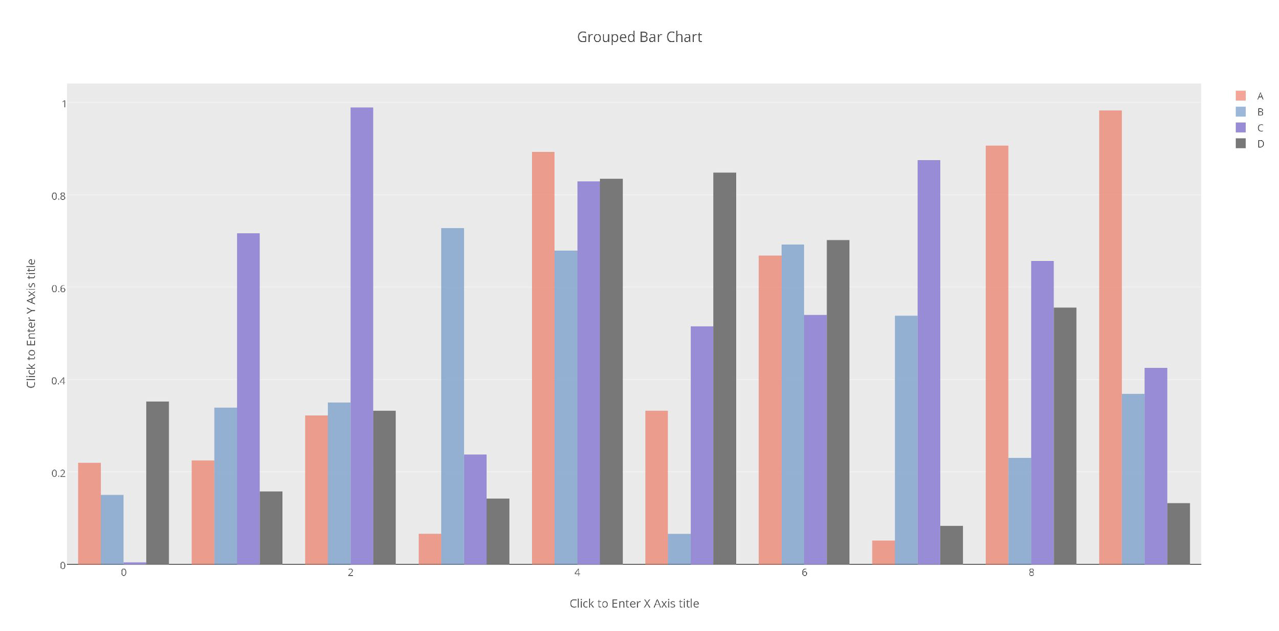
Grouped Bar Charts#
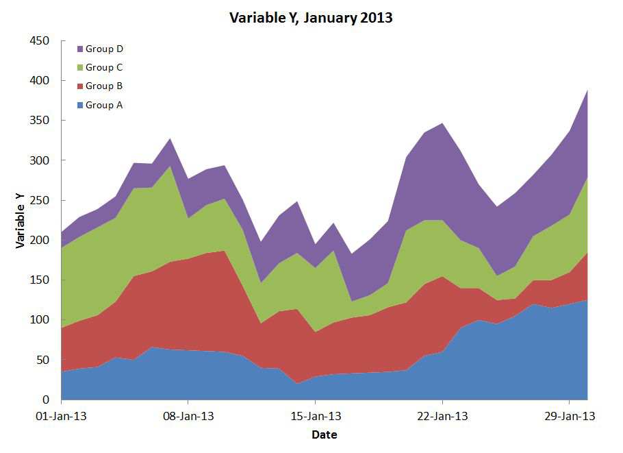
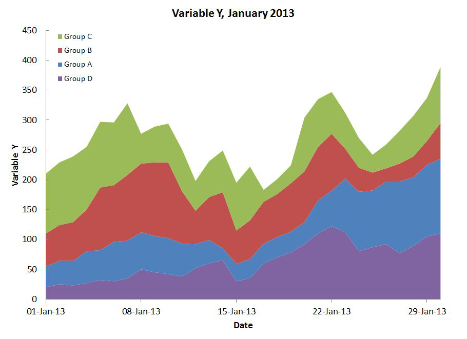
Stacked Bars#
Rarely a good idea.
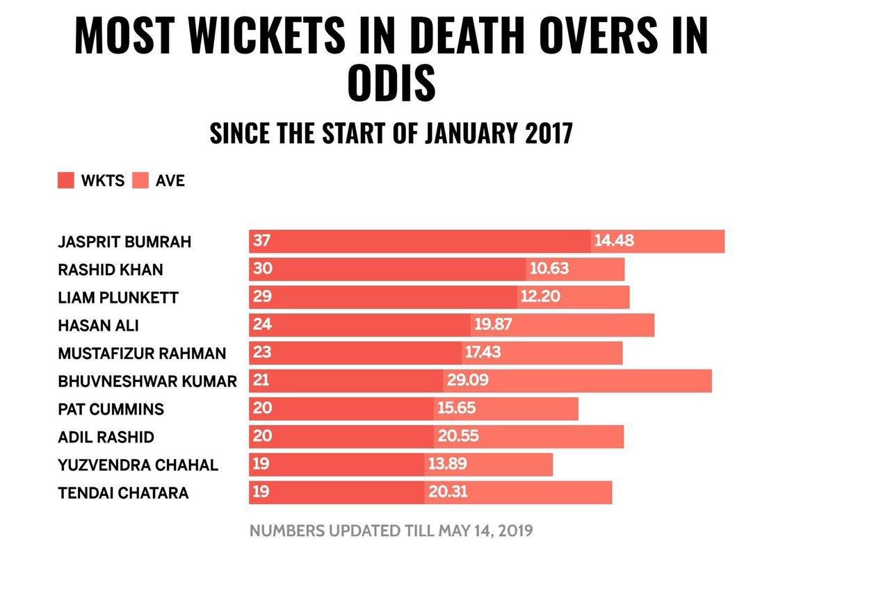
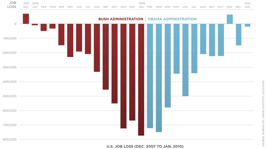
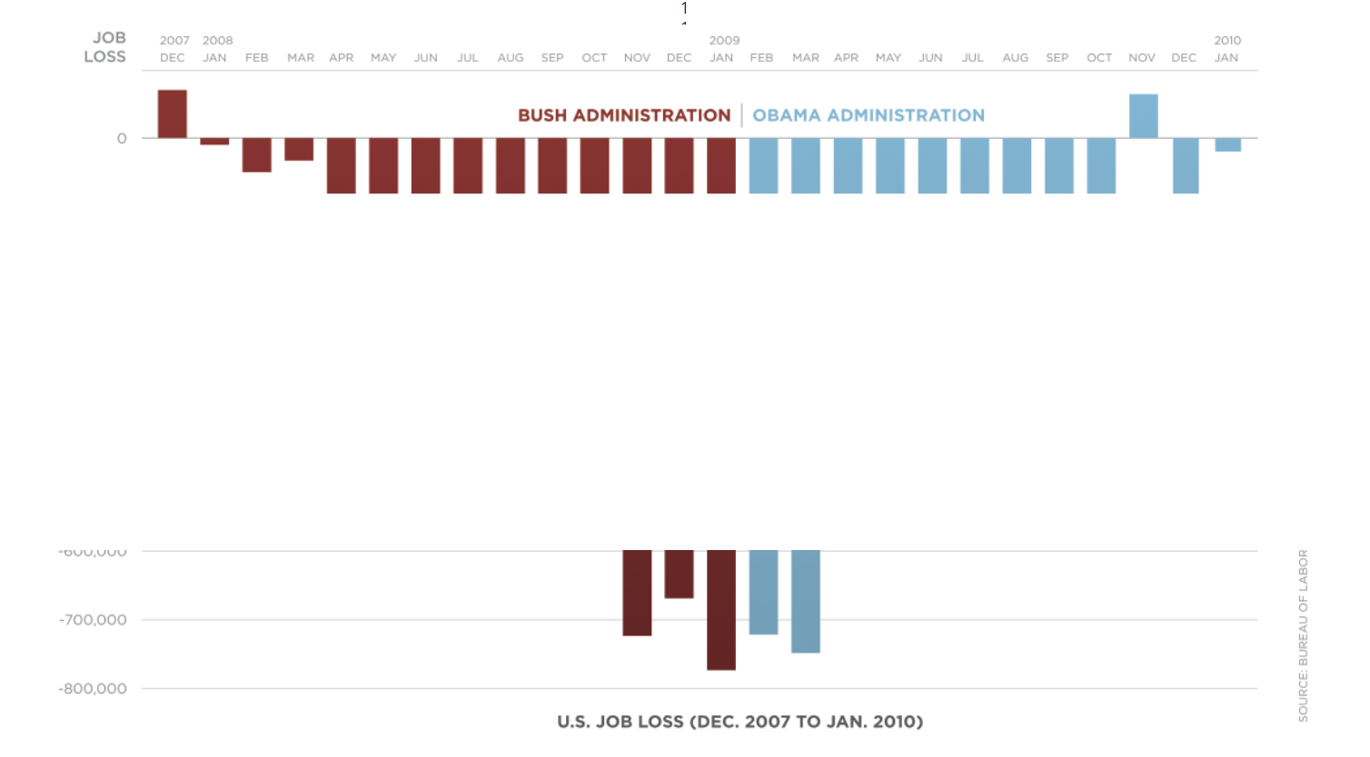
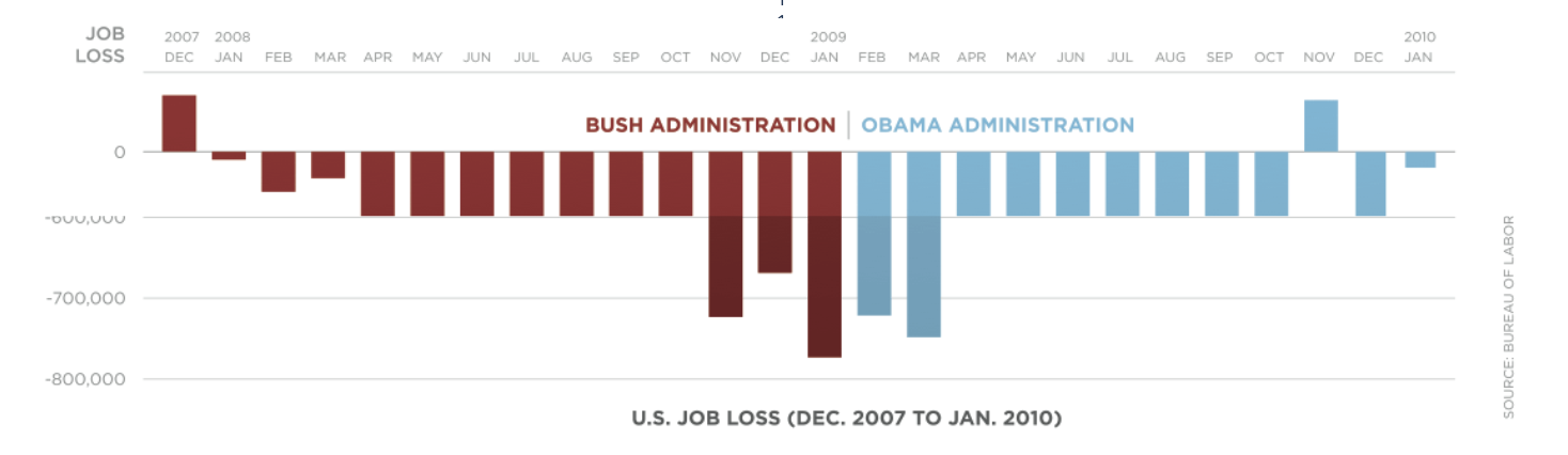
Do vertical bars always go up?#
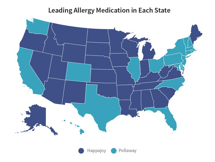
What about geographical data?#
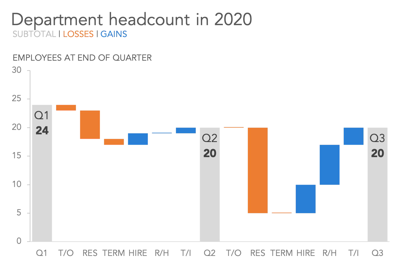
Waterfall#
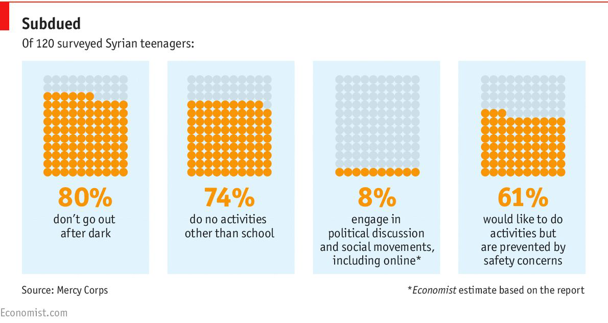
Square Area Charts (Waffle or Unit Charts)#
That’s all the charts#
Summary#
Why we make data visualisation.
What makes a good Data visualisation.
How to make all your charts fantastic.

Exercises#
Optional Exercises#
Read this blog post and use tools like Data Color Picker and Coolors to build and store color palettes for different use cases (a lot of categories, gradients, divergence)
Build a 10 colour colour palette that fits your brand, and follows good colour differentiation principles from the Fundamentals chapter.
Take a look at a slide you made with several charts. List all the Gestalt principles you can spot. Make note of which one is stronger. Consider giving it a makeover based on your findings.
Optional Exercises: Data Viz Review#
Form a pair or a small group
Once a month, send your most important plot (.e.g the one regarding the most important business finding/decision, the one shown to most stakeholders) to your reviewer for feedback. If you form a group, it can be nice to meet and listen to the everyone’s reviews
Each time, give feedback around a different theme:
Fundamentals: message, accuracy, efficiency
Gestalt Principles: proximity, similarity, enclosure, closure, continuity, connection
Chart Types: offer improvements, or alternatives
Storytelling Process: context, choosing a visual, remove clutter, focus audience attention, tell stories